I like the hue saturation in both covers. The colors definately draw my eye to them and if they were sitting on the shelves I'd wander over to see what they were about. I'm not sure about the Title placement with all the negative space in the middle but it leaves me thinking theres more to it if I read the books. Maybe that was your intention!
Over all I really like the colors. I think you did well with them!
Creating Book Covers
I'm in the midst of publishing several books, some of them part of a science fiction series called the D'Angelo Chronicles. My oldest daughter is doing the artwork for the third in this series, but I did the first two myself, and I think it would be interesting to share the process I went through (given that I'm a writer, not a visual artist by any stretch of the imagination, heh).
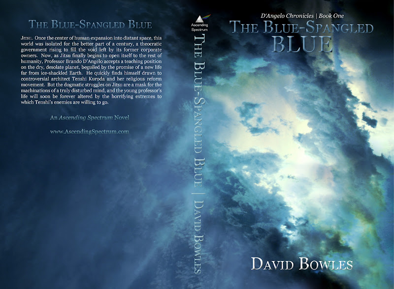
So the first volume is The Blue-Spangled Blue, a title which refers to a psychological state in which one becomes disconnected from the world, caught up in a sort of ecstasy like what dervishes experience in their dances. It also is meant to suggest a deep blue sky, layers upon layers of blue, and it is finally a translation of the Italian lyric "nel blu dipinto di blu" from the song "Volare."
Okay. I couldn't draw any of the characters or scenes in the novel (not and sell any copies, heh), so I got a picture of a cloudy sky with interesting colors, added a filter in Photoshop that tinged everything bluer than normal, and then I rotated the picture and cropped it to wrap around a 5 X 8 inch book with a spine big enough for 432 pages. I then picked a pretty straightforward font (Georgia) and created the title, etc. I played around with styles in Photoshop, beveling and embossing a tad, adding satin, etc.
This is what the final product looks like:
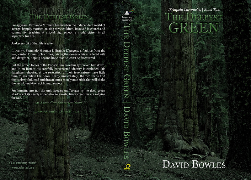
Okay, not horrible, imo. The second volume, The Deepest Green, was a little trickier. Most of the story takes place deep in the heart of an alien forest, with trees that dwarf sequoias and pretty intense-looking aliens. Well, I wasn't going to draw the aliens (my daughter Charlene had, but in a manga-like style that wouldn't have worked for a book cover), so I got my hands on a royalty-free photo of some redwoods, applied a green filter, and used artistic filters to make the forest look painted. But this image would only work for the front of the book, and I needed a wrap-around. So I grabbed a tree that was cut off at the far right of the picture, copied it, and pasted it against a similar tree cut off on the left, and then I used the healing tool to make it look like a single tree. Then I grabbed the middle tree and copied it to the left of this, stretched it out so that it appeared to be rooted off screen, and used the clone stamp and healing brush to clean up. I copied bits of ground and background foliage from the front to the back, did some more cloning and healing, and voila! I then adjusted the color overlay of the text styles from Blue, typed in what I needed to, added the VAO Publishing logo, and I was pretty much done.
This is it:
Dia
15 years ago
pharren
15 years ago
I got distracted and forgot I was going to comment on this; thanks Dia :X
The top one is my favorite, but I like them both. I like the negative space, and I like the clean, simple font. I prefer minimalism in general so maybe that's why they appeal to me. What I wanted to comment on was how well the second one was done. I can't even tell it was photoshopped (aside from the filters). It looks like that is the original photograph or painting. Really nice job on that.
The top one is my favorite, but I like them both. I like the negative space, and I like the clean, simple font. I prefer minimalism in general so maybe that's why they appeal to me. What I wanted to comment on was how well the second one was done. I can't even tell it was photoshopped (aside from the filters). It looks like that is the original photograph or painting. Really nice job on that.