thats pretty impressive.
i missed those types of classes alot.
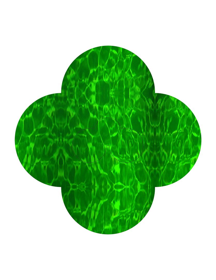
i do like the idea you have going. my only thought would be to have the leave seem more like its floating on the water. Like its apart of it, more than placed over.
Druide
Druide is a company we have to work on this semester - an all-natural body care product company based in Montreal. They're all ecological and shit, which is annoying as hell for me because they're that much more demanding on the packaging side.
They're releasing a product derived from hemp, and everyone one of us had to come up with a distinct concept to build on throughout the semester.
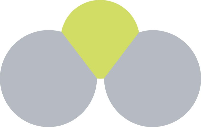
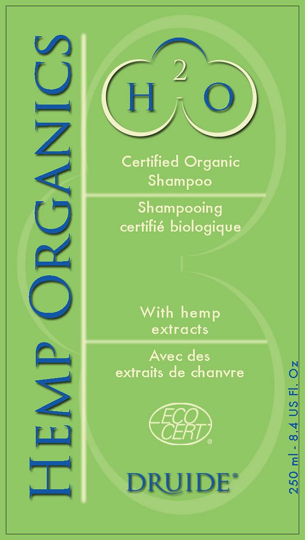
After much drunken thought, I decided on H2O, but with the 2 in superscript as opposed to subscript. H stands for Hemp and O for Organics, except the H is squared! (ie Hemp to the higher power)
One of my first sketches:
http://i11.photobucket.com/albums/a153/somadjinn/simplemolecule.jpg
A simple molecular structure created with Illustrator. Nothing tricky, although it does accuratly represent H2O. 3 circles, 3 letters, perfect placement; H and O for the bottom molecules and the 2 for the smaller upper one.
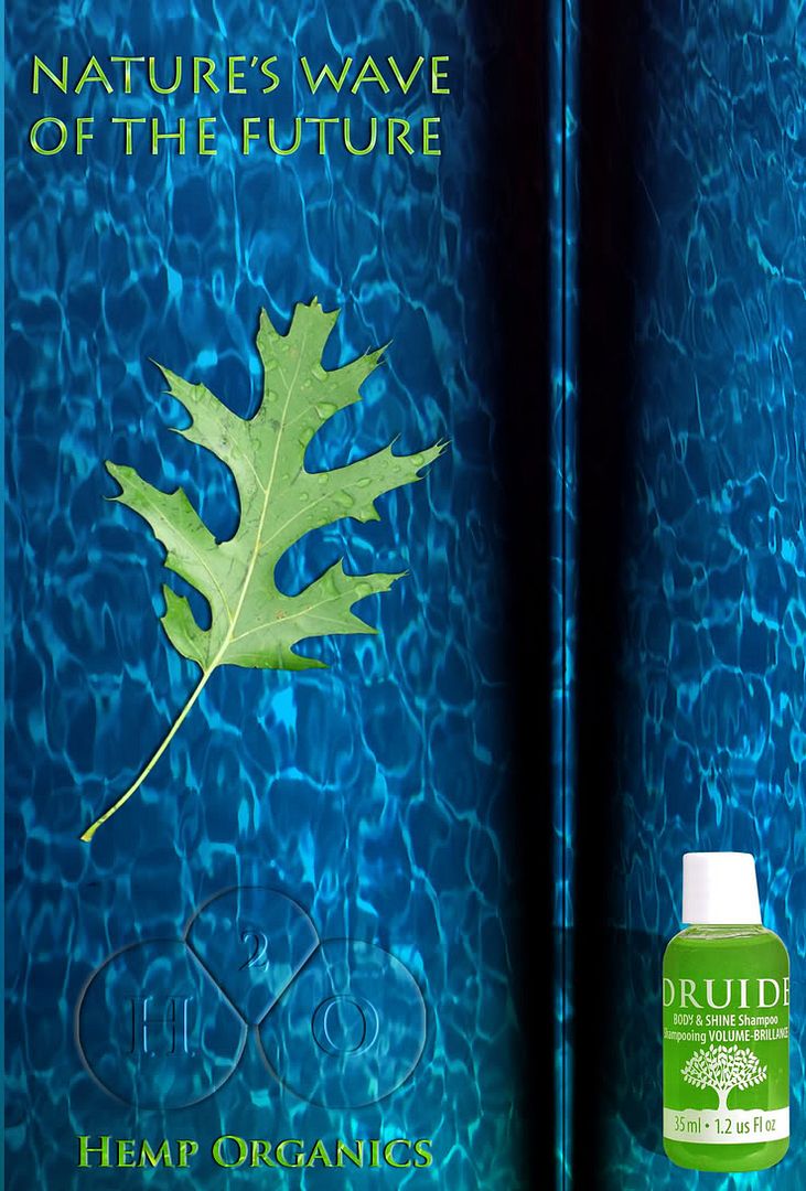
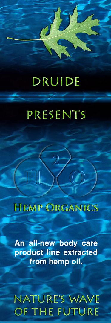
Prof told me he liked the concept, but that I'd have to stick with abstract/modern motif throughout the semester. First of all, we had to do ads:
http://i11.photobucket.com/albums/a153/somadjinn/h20bilboardfinal.jpg
http://i11.photobucket.com/albums/a153/somadjinn/h20newspaper.jpg
Both inspired from morguefile.com (free stock photography site):
http://morguefile.com/archive/?display=deepbluesCN.jpg
http://morguefile.com/archive/?display=PIC0203VN0045.jpg
Flipped the pool shot vertically and played around with blend modes to produce the abstract/watery background
(Also used http://morguefile.com/archive/?display=HPIM0106.JPG for the leaf I masked out)
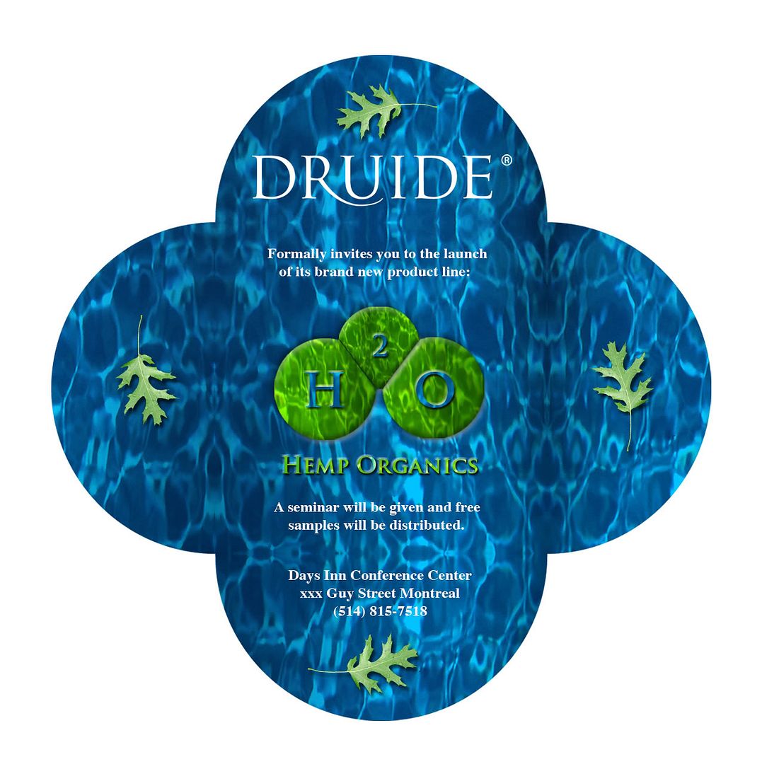
At this point, I figure the translucid H2O logo isn't legible enough (ie gay). We have this surprise invitation to do, and I decide to fix that:
http://i11.photobucket.com/albums/a153/somadjinn/invite1backtent.jpg
That's the very inside of it, with another similar envelope wrapped around it:
http://i11.photobucket.com/albums/a153/somadjinn/invite1stdiecut.jpg
That boils and ghouls is my introduction to diecuts. I had to use an exacto knife to cut around that molecule silhouette :x
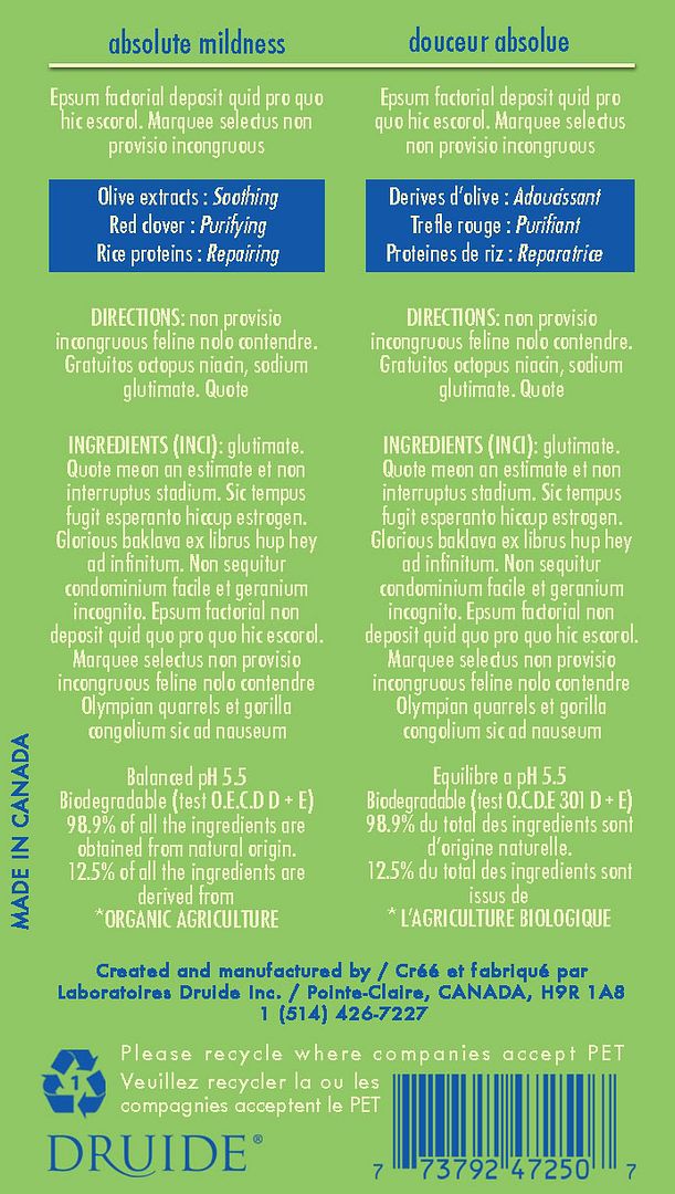
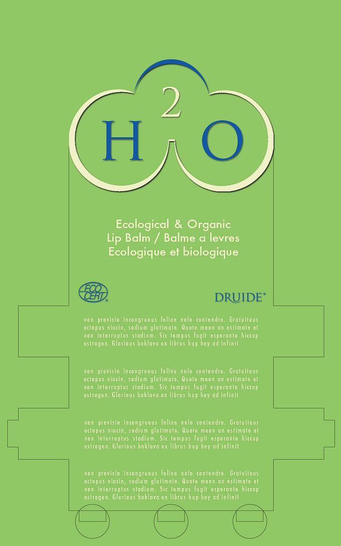
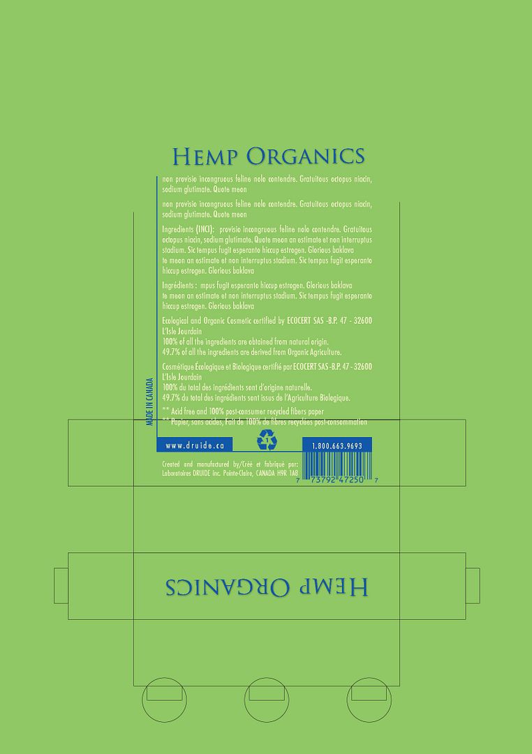
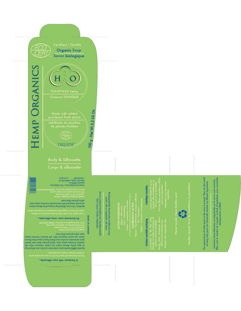
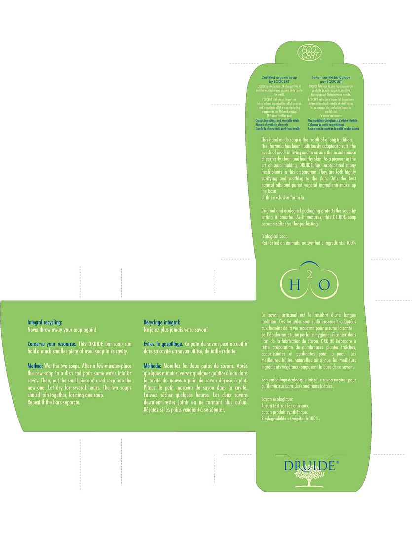
From there on, we were assigned to labels and packaging, with a limit of 3 colours:
http://i11.photobucket.com/albums/a153/somadjinn/shampoobis.jpg
http://i11.photobucket.com/albums/a153/somadjinn/shampoobisback.jpg
http://i11.photobucket.com/albums/a153/somadjinn/lipbalmpackagingfront.jpg
http://i11.photobucket.com/albums/a153/somadjinn/lipbalmpackagingback.jpg
http://i11.photobucket.com/albums/a153/somadjinn/soapbox.jpg
http://i11.photobucket.com/albums/a153/somadjinn/soapboxback.jpg
Dia
20 years ago
Nektar
20 years ago
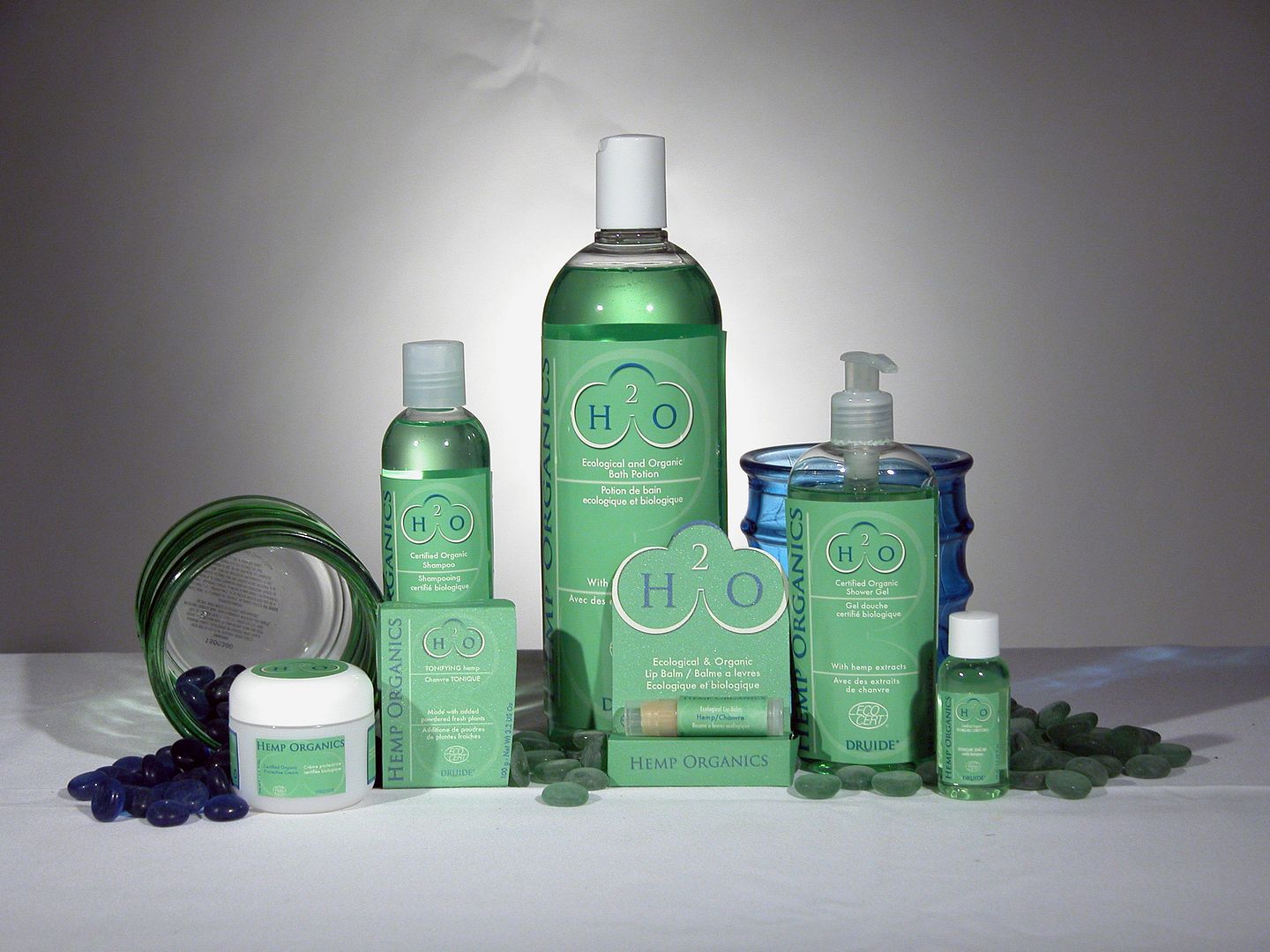
So like we had this photoshoot at school a couple weeks ago, and I just uploaded some pics on my external today:
http://i11.photobucket.com/albums/a153/somadjinn/hops.jpg
Looks a little grainy with my Mac and I had to save with 9 quality in Photoshop (<1 MB because of photobucket). It's an overview anyways, of all the different labels and packages I had to work on, in 3D format.
Thanks for the comment btw. I'll keep the floating leaf in mind for when I have to present my portfolio.
ROzbeans
20 years ago
Zoinks, nice Nektar!!! I like the product picture, that came out pretty damn cool. You learned so much stuff, congratulations on getting thru it all!
Mai
20 years ago
That is awesome work! I love seeing the progression you went through to get to the final product. :thumbsup