Aiko city
Opened poser to answer Mae's question this morning and this was the result.. I didn't get the eye texture I was working on to come out right so it isn't on there but I didn't want to waste the rest of it. (still didn't answer her question either >_< )
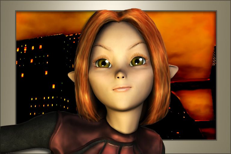
The background is an image I did in Bryce a long time ago, hours and hours making a city and a few shoddy jpg images are all that's left thanks to a hard drive crash.
Aiko
Aiko hair pack
Michiko
bishounen
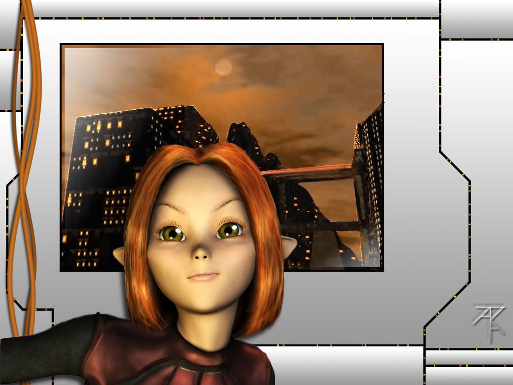
postwork in photoshop.
ROzbeans
20 years ago
Wow that looks all painterly. You sure you didnt freehand that? /wink /nudge Only c/c I would have is maybe smooth her hair out a little, looks pixelized with that close of a shot. Love the background and the earthy colors you used. :thumbsup
Rikr
20 years ago
I concur...hair looks a little jaggy. My only CC on this would be to lose the border. I think that's a great city bg...would like to see the toon in it more. :) But that's just me. Nice colors I really like it :)
Sunbur
20 years ago
I like it! Only c/c would be the same as what they said about the hair :)
BTW the avatar you made from this is just adorable :)
BTW the avatar you made from this is just adorable :)
Mai
20 years ago
Thank ya. I can see what I can do about the hair. =) The background is unfortunately all there is of it. *sniffs at the lost city* I put the border around it because its only that big and a very bad jpg save so I didn't want to stretch it more.
Any other ideas on what to do with it?
This is the original bryce save. =/

EDIT: Edited in the first post more done with the hair.
Any other ideas on what to do with it?
This is the original bryce save. =/
EDIT: Edited in the first post more done with the hair.
Mai
20 years ago
Verileah
20 years ago
Conceptually I like it :D. I dig the track lighting thing (I don't know if that's the right term) especially :D/ You could likely get away with a more intense gradient, some rivets or screws, a scratch or two on the metal panels perhaps. Personal preference would be to vary the texture and colors on the cables. Right now the city looks like it could be either a framed photo or a window...not sure which you wanted to go with.
Jinheim
20 years ago
I think that looks kind of wierd, actually. In the original it looks like she's standing in front of a window or something, and the background looks like it belongs there. In that one the background only covers about 1/3 of the screen space and it's just kinda hanging there. It looks more like a painting on a wall than a background which she's standing against. In the original, the whole thing seems to be made out of various shades of orange, which I think is a very cool effect. Adding in all that grey border cancels that.
Also, this is very trivial, but the eyelashes closest to her nose aren't lining up with the edge of her eyelid
Other than that, I think it looks awesome. The background almost looks as if you painted it.
Also, this is very trivial, but the eyelashes closest to her nose aren't lining up with the edge of her eyelid
Other than that, I think it looks awesome. The background almost looks as if you painted it.
Rikr
20 years ago
I'll have to agree with Jin on the BG. Not that it's bad...because I kinda dig that too, but the original bg with the border does look better to me. I agree about the vividness of the oranges in the first one. The new one dulls it out a bit.
Upon further review, the first one is my favorite. :)
Upon further review, the first one is my favorite. :)
Mai
20 years ago
Thanks guys =) I figured I'd try to do something with it because it was such a small jpg but I'm not really crazy about the update either.. though I spent a disgusting amount of time on the little lights. O_o
I could change the grey hue to blend it in more with the background. I flipped back and forth on that for a while and couldn't decide I which I liked better so I kept the grey but if the first concept is better then there's no need.
I could change the grey hue to blend it in more with the background. I flipped back and forth on that for a while and couldn't decide I which I liked better so I kept the grey but if the first concept is better then there's no need.