I like it, but the one thing that pulls my eye away is the bottom. Maybe because it seems like there's no end...so to speak. Maybe a border or a more defined background edge? If that makes sense.
I like the wings though :thumbsup The layout is sweet, but again the bottom just seems to fade away. I hope that helps.
School logo thingy
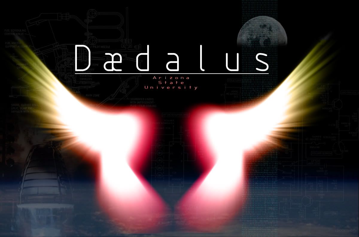
Never made a logo before but im in a rocket group at school to build sounding rockets.. here was my ' winged' attempt. So tell me. how do i make it better? Be harsh. I dont want any bush beating here... I need dun learn'n..
ROzbeans
20 years ago
DriftingEvil
20 years ago
You're right.... how's this. I also changed the font to something less convensional. Thanks for all the responces in my font post :)
Lolanae
20 years ago
Very nice! Which ASU campus do you go to?
DriftingEvil
20 years ago
main
more mods... kassy commented on the moroon and gold colors comming off as pink... so i tried to un-pink the colors a little
Lolanae
Very nice! Which ASU campus do you go to?
main
more mods... kassy commented on the moroon and gold colors comming off as pink... so i tried to un-pink the colors a little
Tor
20 years ago
Nice work, man!
Gilae
20 years ago
I didn't read the 'font' post yet...but it seems to me if it's a logo that the lettering should be overtop of the wings with the wings glowing in the background. That would look totally hot.
ROzbeans
20 years ago
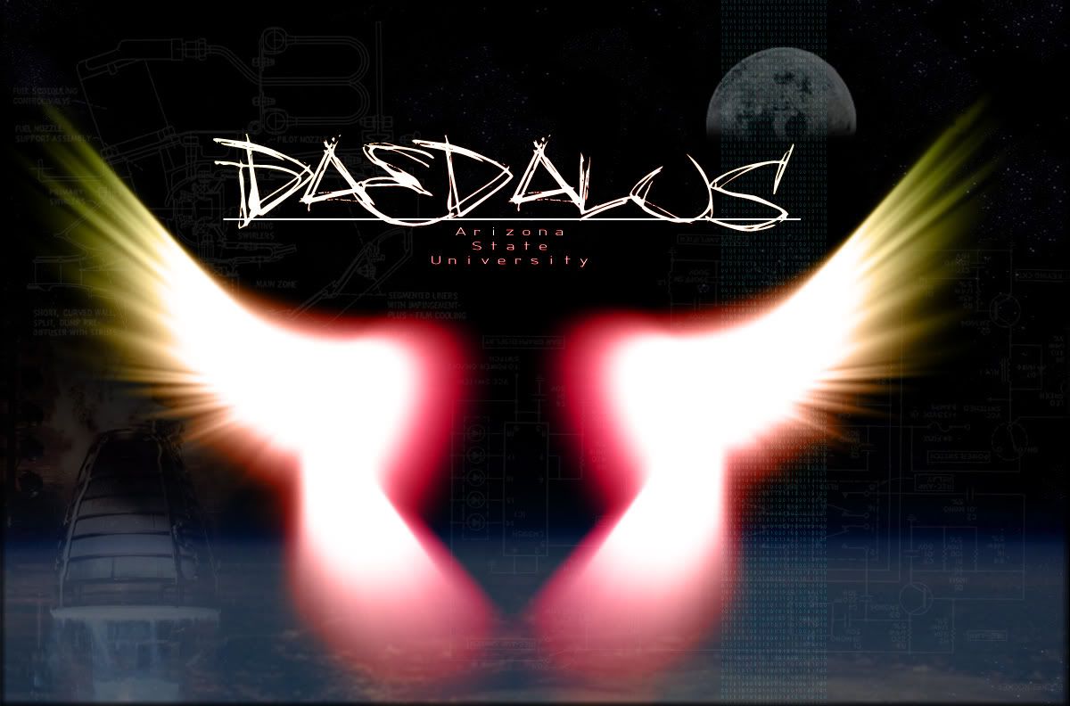
I like your font choice on the 3rd version. You're progressing nicely with each one though. :thumbsup
Mai
20 years ago
personally since the main thing that is your focus point is the wings, I think they should be centered. If they were smaller one side or the other would work but it seems a little disbalancing that they take up most of the image but then are off center.
Other than that, the glowing wings look cool and I like the techical stuff barely visible overlayed behind them. Nice job. :)
Other than that, the glowing wings look cool and I like the techical stuff barely visible overlayed behind them. Nice job. :)