How'd you do the little orbs? Dont know if you know this trick, but use an airbrush of whatever size you want it to be, then filters, stylize (i think) then 'find edges'. That'll give it that glowing edged look. Then you can adjust the hue to whatever color you want. In addition, you can put an outer glow on them to make them even more luminescent.
It wouldnt hurt to give the epic itself an outer glow, just expand the width so it fades (you know what i mean). Experiment with that look, on a separate layer though or it'll do the entire layer, including bruuce himself. Who apparently is turning into quite the sig whore lol.
I like your text effect, you've become superior in making them really pop. That background is so old and used though, consider using an Omens column background, tucked in the shadows but not overall dark like Typei had done. She over did dark and forboding with just plain hard to see.
Touch up his robe with dodge. Not a high degree but around his chest. Separate it on another layer to play with it.
Your border is nice but you can barely see it. Colors dont seem to flow either. I see filagree, something with sharp curls for him. Fade out your triadica and dont forget to slap your name on there. Guild name is nice, but its his signature, not an advertisement of his guild.
Great job, Miss Ruthie. Amazing improvement and I hope to hell you charged him at least 25k for this. :thumbsup
EDIT:
Also if you want a gallery of your work and free website to do it with, go to deviantart.com. Its not just for freehanders. I have my work there now and at the very least its a website for your work that everyone can see everything all together. Its free, but 29.95 for 1 year without adds and some little perks. 3 months is 7.95. Its not bad till you get your own site.
Bruuce
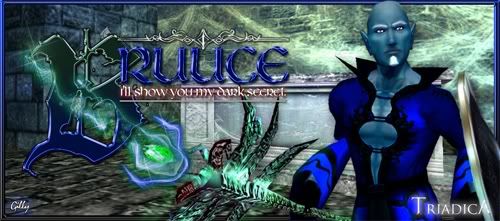
Need some big time help. I'm dying trying to create some particle effects that look...believable. Any c/c for this one would be extremely appreciated. I'll post it at NS too to see what kind of feedback I get.
ROzbeans
21 years ago
Verileah
21 years ago
That quote made me smile :).
Looks like a proper brush for the particle effects; maybe get the settings set so it's a little less dense and more translucent? And maybe make the swirly part wrap around the front of his epic instead of being behind, and the spotty guys in front of the "B".
Wonder what it looks like when it goes off...is that the one that has the smokey effect with the creepy face in it? Pulled up some nice tutorials on smokey stuffs if you wanted to try to replicate what it looks like when it's clicked.
I really like the type, but I'm struggling with depth. Right now the B looks like it's on the background, but then you have the weapon behind the B, so I'm not sure if the type is supposed to be sitting flat on a plane in front of everything, or if it's meant to be behind the toon. Maybe the B just needs to be completely solid? Or maybe the toon is just so overwhelmingly handsome that I just want to bring him to the front *laughs*. Yes, that last bit could just be in my head.
Verileah
21 years ago
In Typei's defense, her sig looked -great- on my new monitor (*pets her monitor*) but you couldn't see it for beans on the old.
ROzbeans
21 years ago
Also your light source on the epic. Where is it coming from and it doesn't look...natural if you dig what I mean. I think an outer glow that widen would compliment it.
I see what you mean with the letter B, Veri. Try not overlapping the words and quote. Also you have that design on the top, but nothing on the bottom. Try and find a balance there.
I see what you mean with the letter B, Veri. Try not overlapping the words and quote. Also you have that design on the top, but nothing on the bottom. Try and find a balance there.
ROzbeans
21 years ago
I guess its personal preference. I always noticed she went a little too dark though. She always ultimately had to brighten up the piece. Wish she'd come back though.
Verileah
In Typei's defense, her sig looked -great- on my new monitor (*pets her monitor*) but you couldn't see it for beans on the old.
I guess its personal preference. I always noticed she went a little too dark though. She always ultimately had to brighten up the piece. Wish she'd come back though.
Gilae
21 years ago
(look up)
Better?
Better?
ROzbeans
21 years ago
Well, honestly? Now it just looks kinda busy. =/ You were heading in the right direction with the glowy orbs, but you can barely see them now. I think the border brings the eye away from the toon and makes your text mix into the background. And the line under your quote isn't centered.
So honest opinion, I feel you went backwards with the update. I dont mean for that to sound bad but I liked what you had before hand.
I couldnt tell what your background was at first, then I realized it was what's her name. The angry dominatrix chick. What did Bruuce specifically ask for? Dark? Spooky? Necroish...whatever that is.
Take a step back and look at your sig starting with your toon. Enhance what you can with his epic and robe, then find a background that compliments him. Pick your text colors that pull from his robe and surroundings so they dont blend in. I think that's what's going on with your updated sig now. It all just blends, there's nothing defined about anything but your borders. I hope that helps. :hug
Gilae
21 years ago
Ugh. I can't for the life of me make stupid swirlies! I put the old background back on (he liked that one) and took out the corners and adjusted the colours a bit. I also adjusted the background to indicate "where the light was coming from" and I think you're right Mae...that helped a lot.
But he wants swirlies and I'm sucking at them thus far :(
This sig is kicking my ass!!
But he wants swirlies and I'm sucking at them thus far :(
This sig is kicking my ass!!
ROzbeans
21 years ago
There you go. The colors of the text looks great now! The trick with the swirlies is this.
If you want swirls like in my sig, on a separate layer, place down some stars with any size brush in the color that you want or pick red (i'll explain that). Then you use your filters and TWIRL them. Place several on different layers to get the effect you want. Now, if you picked red, use filter/stylize/find edges and it'll give you that white outer glow. Then alt U to adjust the hues. Check the top box and then adjust the colors to whatever you want.
You do the same thing with glowing orbs. Place down different size round air brush (not the solid) and do the same stylize/find edges trick. Or what everyone else was talking about on NS is use your blending options/inner and outer glow - adjust the colors. Personally I use stylize/find edges and outer glow. That's what makes them look transparent and luminescent.
Hope that helps and yes it looks much better. Just play around with the epic on a separate layer and play with the twirl option and stylize/find edges. They're uber easy and fun and the results are beautiful.
Gilae
21 years ago
I think THIS is the part I was having issues with. I couldn't figure out how to make them twirl naturally versus me just drawing them in myself. Suppose I wanted to do twirls such as are in the one you did for my sig?
Then you use your filters and TWIRL them.
I think THIS is the part I was having issues with. I couldn't figure out how to make them twirl naturally versus me just drawing them in myself. Suppose I wanted to do twirls such as are in the one you did for my sig?
Gilae
21 years ago
Now what say you? Do they look gimp?
ROzbeans
21 years ago
That looks great! Double the layer to deepen them maybe? Throw in some tiny light orbs to accent it? Looks great though!