I think these look great! I would play around with a black outline on the areas where the MKY are, and maybe make the symbol in the middle of the C a tad larger.
Nice work Nektar!
CMKY logo
Alright, I've been mulling over my logo for the past couple weeks. In the last couple days, I think I finally found a definite concept to work with:
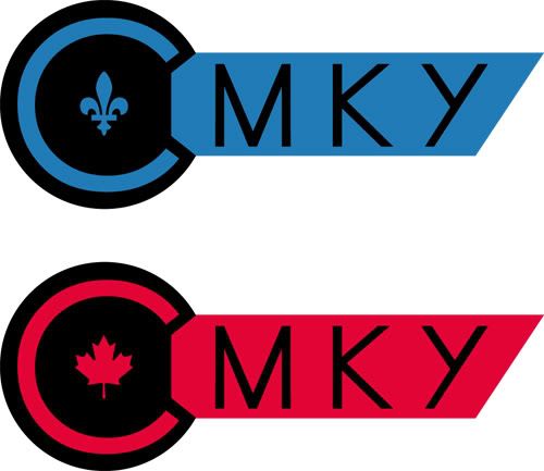
As mentioned a while ago, CMKY stands for Contemplating Monkey. So I started off by trying to split the C from the MKY, all the while maintaining some sense of consistency. That's why I placed the C in a circle, and Century Gothic provided a [near] perfect fit.
I put the rest in small caps, bounded by straight lines. Some font tweaking on the M and Y to establish sharper parallels.
Then I sought to fill in the empty space at the center of the circle. That's when I made use of the CMYK colour scheme: The blue fleur-de-lys for Quebec, the red maple leaf for Canada (I hate magenta), and to come, a yellow banana for the monkey.
So what do you think? Any advice on how it can be embellished? Bear in mind my minimalistic mentality. I want to keep it clean and simple, but dinstinctive enough to stand out. The key-type shape is no accident, and I'm wondering if I should add a touch of key-like contours.
Feel free to critique any aspect of it, even for technicalities like tracking and whatnot.
Regards
Rikr
20 years ago
Nektar
20 years ago
Thanks a heap. Still feel it's far from complete, but any tip is grealy appreciated. For the black outline, did you mean something like this?

Left out the symbol this time because I'm wondering if it makes the logo too busy. I'm afraid that if I make it larger it will distract from the C. If anything, I wanted to make it smaller...
Rikr
I think these look great! I would play around with a black outline on the areas where the MKY are, and maybe make the symbol in the middle of the C a tad larger.
Nice work Nektar!
Thanks a heap. Still feel it's far from complete, but any tip is grealy appreciated. For the black outline, did you mean something like this?
Left out the symbol this time because I'm wondering if it makes the logo too busy. I'm afraid that if I make it larger it will distract from the C. If anything, I wanted to make it smaller...
Temprah
20 years ago
ohhh I like the black line border, and I like it better without the symbols
Rikr
20 years ago
Yes that's what I meant with the border. I do like that. :) I know what you mean about the symbol....I think if you make it smaller, that it will look out of place. I see what you mean about making it larger too. I think it needs to be there though. No symbol in the middle of the c looks empty. But that's just my opinion. :)
FyreGarnett
19 years ago
that border sets it off just right. overall, i like the simplicity. the symbols adda nice touch and imo balance the empty space.