Sharing
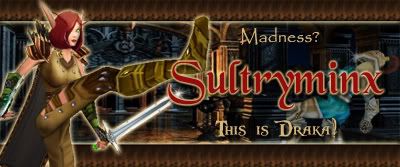
A new sig I put together for my BE. The inspiration will be easy to figure out lol.
ROzbeans
19 years ago
HAHA nice, Trak. I like it, you have a clean border, nice and bright text and your blood elf looks awesome. She's kicking..what is that, a paladin? (snort) The background is a little hard to see, but her pose is still hilarious! I dont know if maybe you might want to lower the text so you can actually see the background person a little more, but that's more preference. :thumbsup
Mai
19 years ago
Looks really good. I see what Roz is saying about the background being hard to see but I kind of like that. It focuses the attention on the character and the name. It might make it hard to tell what she's doing but only if you haven't seen the movie, in which case you probably still wouldn't get it anyway. The border, the fonts and your colour choices are all fantabulous. :clap
Not meant to be disagreeing with Roz's very valid opinion just my thoughts. *Bats eyelashes at Roz* :sing
Not meant to be disagreeing with Roz's very valid opinion just my thoughts. *Bats eyelashes at Roz* :sing
Den
19 years ago
How cool! Your BE looks like my Pimmento! :) Nice!
Trakhina
19 years ago
Thanks! The guard was added to the background so I could bump up his opacity. Just wanted to ensure the focus remained on the main character. *winks*
ROzbeans
19 years ago
That's it. Next time we hook up again in Atlanta, I'm making you buy me coffee! :moon hehe
Mai;78125
Not meant to be disagreeing with Roz's very valid opinion just my thoughts. *Bats eyelashes at Roz* :sing
That's it. Next time we hook up again in Atlanta, I'm making you buy me coffee! :moon hehe
FyreGarnett
19 years ago
that is just too neat Trakhina!
(and Roz - better make ehr get you a Venti....)
(and Roz - better make ehr get you a Venti....)
Mai
19 years ago
0Noes!!!! *runs and hides* :hide
Trakhina
19 years ago
Updated the top. Not sold on the new name font yet.