I really like him, though I feel as the the sword is upside down....might be wrong, just something about it isnt right. I'd maybe widen his stance a bit, his top half is kinda relaxed but ready, while his legs are stiff.
And the horse just doesn't look scary enough, but I think thats more of a Mill horse thing than you. I love the glow effect in his eye, and your painting on his mane, but the horse himself has no fire in him, no spirit. He's just standing there. Maybe make him pawing the ground with a front hoof, arch his neck a bit and bring his head in, ears back, so he's in a more aggressive stance. Hard to explain, I'll try draw what I mean if I get a chance :)
As for the background, I like it, I wouldn't have guessed its EQ til you said hehe. But looking closer, it looks like the gate with the Guardian thingies you gotta click in Direwind?
Need CC on commish :(
I'm literally about to beat my head on something. I knew going in this was going to be a tough commission, and the person was going to be very hard to please, but this is the toughest time I've ever had on a piece. I've stared at it, changed it, painted on it until I couldn't tell you if it was total crap or not.
I was hoping to get some cc from you guys. The latest things he wants me to add are 1) red inlay to the knees, more orange reflections on the legs and 3) he doesn't think the "metal look" to the armor on the top matches the bottom...which it doesn't exactly...but he specifically requested that Xurge3D armor http://www.xurge3d.com/inc/sdetail/1386 but he didn't want the leather looking pants. So I mixed and matched with the Fantasy armor legs and feet and tried to make it match. All the recoloring I've done is based on what he's asked for.
I know the hands look weird. And the background is an EQ screenshot that I had to blow up and paint on (it was specifically requested). Fuck, it all looks weird, bleh.
credits: M3/Bish recolored by me/Hair, horse's mane and tail are a mix of my painting and Heavenly Hair PS brushes/Mil Horse/Pyro PS brushes used for fire/EQ Epic art/Fog brushes from R'osity/see anything I forgot just ask
http://diabolicalart.250free.com/Temp/azguard69/index.html
thanks for looking, I'm almost embarrassed to show it :(
Jetamio
19 years ago
Rikr
19 years ago
I agree with the sword it does look upside down. I also agree with the leg stance. The background is fine. Actually I really like it.
Lunna
19 years ago
One thing I noticed right away is the horses mane, tail and flame effects are blowing in a strong wind. Which, seems to not really efftect the character at all. Infact the effect on the sword maybe going in the oposite direction.
I have to scoot and get to work but I'll post more in an hour or two about the horse. you can make him soooo very dynamic and skeery *nod*
I have to scoot and get to work but I'll post more in an hour or two about the horse. you can make him soooo very dynamic and skeery *nod*
Janthin
19 years ago
Well I've seen a lot worse, but I'd have to agree the piece doesn't quite hang together. I think this is most likely due to the client's micro-management of your art, frankly. A couple of possible suggestions:
Make him smaller. He's bigger than his horse. This seems odd to me. Or put the horse farther away, so they are not sharing the limelight so much. There's no focus to the piece, your eyes wander around.
I think the armor looks fine, although his pose is very static, with no action. Face isn't bad, but I'd prefer it if he was looking right out at you, rather than to the side. He kinda looks like he doesn't care about anything at the moment. There's no emotion there at all.
The background is somewhat blurry, but it could work. Add a little contrast to it, perhaps. Put something in the sky, a moon or cloud or something identifiable.. birds flying, I dunno. Something to give 3d-ness to it.
Ok I'll shut up now. I know what a pain it is to work for some folks. This is why I simply gave up on taking money for sigs and portraits, period. If they ain't paying me, they can't complain or tell me how to do it. Although they sometimes still do, in which case I say "Artistic license, take it or leave it" and move on :)
Temprah
19 years ago
i think part of the problem with the pants could be that the shadowed areas seem redder and not as dark on the pants vs the legs. Also if you were to clone in a tad of the design from the top into parts of the pants they would tie in together more IMO.
The rest of what I see has been mentioned i think.
The rest of what I see has been mentioned i think.
Shaelynn
19 years ago
Thanks everyone, you have given me some things to consider. I think if I knew when I started everything I know NOW about what he wanted, I could have done a better job, lol.
I've worked so long on it, I hate the thoughts of changing the poses of the horse or the guy. Part of the problem is I keep trying to change things they request without actually starting over or losing what I've done so far...so it's become a little jumbled.
My first draft was him standing alone, then I later had to add in the horse...I don't think I ever got the perspective right.
Even though it makes me cringe, I might start over on it. Maybe hehe.
Lunna
19 years ago
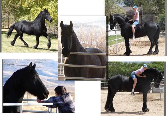
I really would suggest atleast redoing the horse. I think the character looks great. Below are some examples of the breed I think of when I imagine a Nightmare. You can see just how large they are in comparison to a person.
If it were me, I would put the horse behind your guy so that the focus isn't do devided and it would help with the size/perspective thing too.

If it were me, I would put the horse behind your guy so that the focus isn't do devided and it would help with the size/perspective thing too.
ROzbeans
19 years ago
I'd offer it to him as is and if he complains, tell him that you'd need to redo it and to charge accordingly. You can tell you put A LOT of work into the piece, don't sell yourself short with picky ass customers.
Nothing really to add to the cc given - but yeah his legs looked washed out compared to the rest of him and they almost look like they're pointing in a different direction than his body - its odd. The face is great but yeah charge this guy thru the nose.
Nothing really to add to the cc given - but yeah his legs looked washed out compared to the rest of him and they almost look like they're pointing in a different direction than his body - its odd. The face is great but yeah charge this guy thru the nose.
Jetamio
19 years ago
Trouble is the Millenium horse just doesnt quite cut it (imo anyway lol). It's too...I dunno, not horsey. I always just end up hand drawing mine cos I don't like Millenium horse.
Sabby
19 years ago
I worked on his art. Before he paid cause his GF was a customer.. and in the end he said nvm, and wasted my time... =/ He was difficult to work with, what you have is awesome, but he's sorta nitpicky customer.
LillianaSapphire
19 years ago
hiya,
I think the image isn't very balanced to be honest. The colours really do conflict against each other and it makes it a little painful on the eyes to view. Well for me at least. One thing i noticed is, there seems to be a strong wind to the fire on the hooves, but its not affecting his hair or the flames on the sword at all.
I really like how the horses eye glows, it does emphasise the feircness, but not enough IMHO. I think, like the others said his pose needs to be worked on, or you could have his head bend down with his teeth showing like he's winnying *wow i can spell can't i?*, with his foot clodding at the dirt.....
Anywho i'll shurrup. lol
Anna
xxxx
Shaelynn
19 years ago
Thanks for the comments everyone. The input on poses and perspective was very helpful. Thanks especially for the pics, Lunna :)
Jetamio - thanks for your comments and I wish I was talented enough to draw a horse from scratch :) unfortunately I'm not, so I'm stuck with modifying the MIL Horse.
Lilliana - I appreciate what you're saying but the colors weren't my choice, they were what was requested.
Sabby - wow, I knew you had worked with her but didn't realize about him :(
I'm limited on some things I can change, but I think I definitely need to rethink my positioning and posing. That's probably what was bothering me so much but I just didn't want to change it.
Appreciate your time and help! :)
Sabby
19 years ago
The reason I left off the CC is because of who it was. I assumed the image was based on all the things he wanted incorporated. Neo is awesome to work with, nudge her some to get her to make him like it~ /snickers
Its hard to work on images where it is all so controlled by the customer, as it ends up being something we the artists don't like at all usually in the end. ;) Kudos to you for being able to take it and still make something pretty. ;)
Its hard to work on images where it is all so controlled by the customer, as it ends up being something we the artists don't like at all usually in the end. ;) Kudos to you for being able to take it and still make something pretty. ;)