my new sig
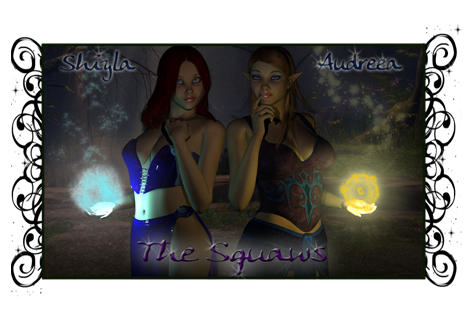 open to all suggestions to make it better... left is my high elf cleric right is my high elf(but thinks she's a wood elf) chanter
shiyla
17 years ago
oh and my guild calls me the squaw cause of my hunny being chief kwina/redman lol
ROzbeans
17 years ago
[13:59] ROzBeans: want some cc?
[13:59] blutigerzeyez: ya
[13:59] ROzBeans: your text - http://www.photoshoproadmap.com/Photoshop-blog/2007/07/22/the-best-80-photoshop-text-effects-on-the-web/
[13:59] ROzBeans: try that site and play with the photoshop text effects. try something new, other than the outerglow. There is so much more the blending options can do for you.
[14:00] ROzBeans: vary your text as well and instead of centering the girls, try putting the on the side, narrowing the sig a little so you can put the text to the side of them, centered.
[14:00] ROzBeans: your lighting is way dark - the spell effects are nice but they look washed out compared to the darkness of the piece.
[14:01] blutigerzeyez: i blame kwina on that >< he killed my spot light
[14:01] ROzBeans: your trailing spell effects are too obscure, too blurred and doesn't flow with the brightness coming from their hands
[14:01] blutigerzeyez: he likes his stuff dark and saturated which isnt my style lol
[14:01] ROzBeans: well who's doing it, you or him? tell him to go away!
[14:01] blutigerzeyez: ok kk glad i saved it all
[14:01] blutigerzeyez: me LOL
[14:02] ROzBeans: i'd redo the lights so you can see the girls
[14:02] ROzBeans: you don't have to do a ball of light, you can just illuminate their hands - subtlety makes more of an impact
[14:02] ROzBeans: http://www.dafont.com/ - definitely pick up more fonts
[14:03] blutigerzeyez: those are pinlights actually from daz
[14:03] ROzBeans: there are a plethora of fonts out there
[14:03] ROzBeans: well i don't know daz lighting =/
[14:03] blutigerzeyez: i didnt do any lighting in photoshop
[14:03] blutigerzeyez: i find it makes stuff pixelated lol
[14:04] blutigerzeyez: gonna take a shower and clear my head and redo it hehe
[14:05] ROzBeans: kk
[14:05] ROzBeans:
[14:05] ROzBeans: the pose and girls look awesome though
[14:05] ROzBeans: good choices
[13:59] blutigerzeyez: ya
[13:59] ROzBeans: your text - http://
[13:59] ROzBeans: try that site and play with the photoshop text effects. try something new, other than the outerglow. There is so much more the blending options can do for you.
[14:00] ROzBeans: vary your text as well and instead of centering the girls, try putting the on the side, narrowing the sig a little so you can put the text to the side of them, centered.
[14:00] ROzBeans: your lighting is way dark - the spell effects are nice but they look washed out compared to the darkness of the piece.
[14:01] blutigerzeyez: i blame kwina on that >< he killed my spot light
[14:01] ROzBeans: your trailing spell effects are too obscure, too blurred and doesn't flow with the brightness coming from their hands
[14:01] blutigerzeyez: he likes his stuff dark and saturated which isnt my style lol
[14:01] ROzBeans: well who's doing it, you or him? tell him to go away!
[14:01] blutigerzeyez: ok kk glad i saved it all
[14:01] blutigerzeyez: me LOL
[14:02] ROzBeans: i'd redo the lights so you can see the girls
[14:02] ROzBeans: you don't have to do a ball of light, you can just illuminate their hands - subtlety makes more of an impact
[14:02] ROzBeans: http://
[14:03] blutigerzeyez: those are pinlights actually from daz
[14:03] ROzBeans: there are a plethora of fonts out there
[14:03] ROzBeans: well i don't know daz lighting =/
[14:03] blutigerzeyez: i didnt do any lighting in photoshop
[14:03] blutigerzeyez: i find it makes stuff pixelated lol
[14:04] blutigerzeyez: gonna take a shower and clear my head and redo it hehe
[14:05] ROzBeans: kk
[14:05] ROzBeans:
[14:05] ROzBeans: the pose and girls look awesome though
[14:05] ROzBeans: good choices
Laschae
17 years ago
It might just be me I dunno but they look a little squished to me ... like it wasn't resized properly =\ Also I think on the Daz website there are tutorials that might help with the lighting... http://www.daz3d.com/i.x/tutorial/0/-/?&_m=d Maybe something useful there? Or maybe search the Daz forums... not familiar with D|S =\ Other than that they looks really cute just a bit dark :P
Den
17 years ago
Way too dark for me...I had to copy it and lighten it up so see it so I could appreciate it :)
shiyla
17 years ago
so i rerendered and i have 2... one lighter and then one in the middle heres the lighter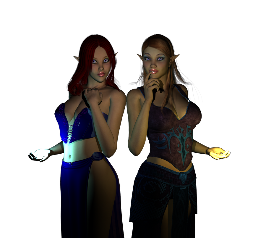
and the darker
HALP!
and the darker
HALP!
Lillaanya
17 years ago
i like the lighter of the 2 much better personally. You still have drama, but you can see what is going on much better.
I do think you could stand a little more lighting from the front however. Nothing harsh, very low intensity to help soften the shadows cast by their hands a little bit. 2 lights with very low intensity placed in front, high and to either side might work. Remember very very low intensity, and turn shadows off on them, you don't need them to light the scene only soften your shadows a little. You might also play around a little with another light behind them. Again, not harsh, and no shadows. What this will do is pick up the outline of the figures just a bit and give you a little more detail while keeping it dark and moody still, coloring it a blue or purpleish will give it a bit of a moonlit look.
I love their poses cant wait to see how it all comes together :)