Ok, my opinion, its too small, too empty, too dark. too bland. I am all for dark btw, its just literally *too dark*, and im on a really bright monitor. The font choice for the navigation could be improved.
Maybe you should go with the theme of the name and use some cyan/mag/yellow accents on the black. Pull it together. Right now its a polygon with some scattered letters and the given navigation.
I dont want to tell you how to design it, and i dont want you to think it sucks, its just unpolished to me. there isn't a whole lot more i can comment on right now ;)
CMKY
It's been a while, and still struggling to optimize my boss' website. I've had my own domain set up for a while though, cmky.ca
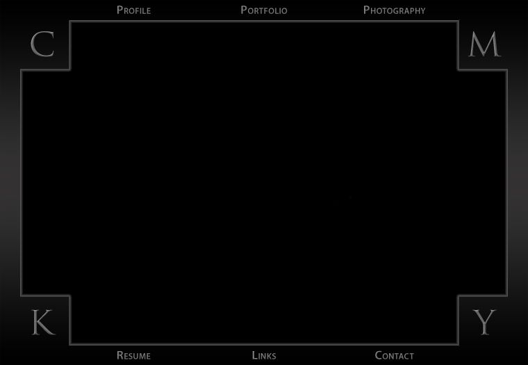
For now, I only use it for testing Silver Tiger Printing's website, but it is my domain and I wanna make something out of it. So I wanna know what you think of the following template: http://i11.photobucket.com/albums/a153/somadjinn/main.jpg
That would be the backdrop for any standard page (iframe).
CMKY stands for Contemplating Monkey, and also a dyslexic twist to CMYK (cyan magenta yellow black) :)
Vex
20 years ago
ROzbeans
20 years ago
Well shoot, you gotta throw something with a monkey up in there. Unless it's a professional site, but still...some cute little monkey logo =)
Guest
20 years ago
Maybe like a technicolor monkey?!
Nektar
20 years ago
That might have been a little premature. There really isn't much to the page except the "outer" template. But I do wanna start off on the right foot.
I want to keep the corner (ie scattered) letters for visual ambiguity. It conventionally spells out CMKY, but a clockwise eyeflow will reveal CMYK. A sense of contrast which I hope to constantly convey throughout the website, especially since monitors typically deal with RGB (as opposed to CMYK for prints).
That said, I definitely need to incorporate the CMYK colour scheme as a prominent feature. An effective logo would help, but so far I'm stumped. I can trace, I can design, but I can't sketch for crap.
More to say, but little time. Thanks for devoting some of yours to me.
Vex
20 years ago
i did a logo awhile back for a banking software company. I spent 4 days bitching about how much im never going to do another damn logo again ( and believe me, im not gonna ), but i just opened photoshop, spent 20mins on something, and said "if they dont like this, they can find someone else".
oddly enough its now a 4ft display at their HQ. it feels WEIRD seeing something i made that big for the world to see. hehe
oddly enough its now a 4ft display at their HQ. it feels WEIRD seeing something i made that big for the world to see. hehe