
Typographic Challenge - A 'Type Face'
Creating a 'Type Face'
I pulled this out of one of my old books, called A Typographic Workbook by Kate Clair. This is more typography than Graphic Design, but in graphic design typography is just as important as illustration and layout, so I figured a fun thing like this might prove useful.
Choose one font and, using capitals, lowercase, numerals, and/or punctuation, create a face (human or otherwise) from the characters. You can angle, reverse, or scale your characters, but they must maintain their integrity. You may not cut up the characters, but if they bleed off of the page you can trim the edges. You may use both the Roman and the Italic version of the font.
The original exercise limited the colors to black, white, and gray, but I’m not going to require that :D. Make a recognizable face using ONLY letters from ONLY one font, and that’s all the rules I think this needs. Oh, and keep it to 800 by 600 or under, for the sake of the tables.
So what’s the point? Well, quoting the book again:
To encourage designers to look at the detailed nuances of typefaces from different families.
To look carefully at the forms that make up letters in different families.
To experiment and play with letters from different families
To utilize type as a visual element, an abstract design form.
To observe the details of letters from different families more closely.
Mostly everyone gets to have some fun and get creative with fonts!
Verileah
19 years ago
Here's mine - it's goofy :X Edit - I forgot to say the font! It's Obelisk Light.
Den
19 years ago
Mine - font is MA Sexy... ... ... lol

Calimaryn
19 years ago
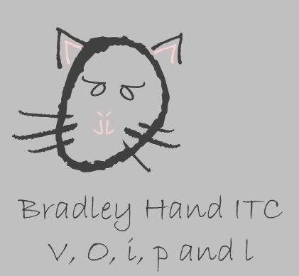
Mew!
tamaelia
19 years ago
/squeee @ the kitty face!
Eve
19 years ago

Babyface :) Dot2Dot font
Babyface :) Dot2Dot font
Wystro
19 years ago
I love those faces! My font is Aquiline Two.
Sarah
19 years ago
I got to making this and as I worked it kept looking more and more like a snowman face, so I made a snowman. The font is called Lotharus.

SinnedAria
19 years ago
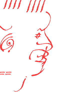
A pierced dude done in Book Antiqua! Quite challenging, and fun. I enjoyed adding the detail.
