The idea is lovely.
The lighting is also very nice. I think however that overall you should colour balance the image. Add some more warmer tones to the 'whole' image to help bring the image together and make it more complimentary. Use some warmer blue tones in the background to emphasise the warm tones of the dragon... if u understand what i mean.
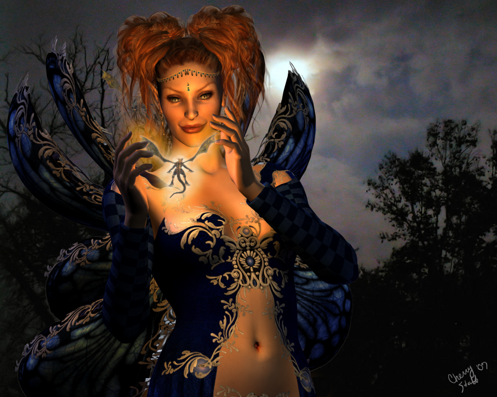
Lookin for CC on this one
done for a frineds upcoming birthday...she loves elves n butterflies....so I thought Faerie was in order..
I just agonize over doing lighting so any comments hints...most appreciated
CC about any aspect of the pic really...I just want to learn to get better...

CREDITS:
V3 base from Daz3D with Claudia texture from Thorne & Sarsa @ Renderosity
Emerith Eyes (don't remember where they came from)
Petite Fleur hair from Daz3D
Celestial Jewels earrings n headchain from Harver Mann @ Daz3D
Faery Wings Deluxe with Tyla texture...available @ Daz3D
Dress is MFD from Daz3D with Tyla texture
Dragon is Mil Dragon 2 from Daz3D
Lovely awesome background sky is from 
Face morph, poses, lights and what postwork was done...all done by me
put together and rendered in Poser7...Postwork done in PsCS2
LillianaSapphire
18 years ago
Elfykins
18 years ago
Lessa suggested that I add a lighter brighter glow arounf the dragons body center...to make it more realistic.. and showed me an example...
I thank her very much for that...I was kind of at a loss as to how to mkae him more "glow-y" Between not painting much on here and being up for 46 hours workin on this thing (it wouldn't let me leave it alone)....
Anyways...I have taken her suggestion...I hope I did it properly....had to delete the layer a couple of times before I came up with something I was reasonably satisfied with...
Elfykins
18 years ago
ok ACK...I see now that I look at it'''the glow is TOO much...gonna fix it now...
Elfykins
18 years ago
Ok fixed it...I hope...

Lessa
18 years ago
very nice, only other cc I might suggest is maybe do a slight blur on the background. It'll help to get rid of the photo pixel dots.
Elfykins
18 years ago
Will see what I can do with it...spent literally hours messing with the few lights already in it...I did add a coupld of bluish ones from the back n off to the side...because of the moon back there...but I guess they aren't positioned right or aren't strong enough..
I do think I am getting better at doing the lights on my own though...last time I tried to do a light "glowing" from something it looked like scheisse on toast
And yes I know what you mean...just not sure if I can get it looking right..ty
LillianaSapphire;90202
The idea is lovely.
The lighting is also very nice. I think however that overall you should colour balance the image. Add some more warmer tones to the 'whole' image to help bring the image together and make it more complimentary. Use some warmer blue tones in the background to emphasise the warm tones of the dragon... if u understand what i mean.
Will see what I can do with it...spent literally hours messing with the few lights already in it...I did add a coupld of bluish ones from the back n off to the side...because of the moon back there...but I guess they aren't positioned right or aren't strong enough..
I do think I am getting better at doing the lights on my own though...last time I tried to do a light "glowing" from something it looked like scheisse on toast
And yes I know what you mean...just not sure if I can get it looking right..ty
Temprah
18 years ago
when i want to tie the tones of a picture together, when they're as different as this a lot of time i sample one of the colors from the piece (i'd say a blue from the background sky area, very subtle almost white-greyish maybe) and do a layer over everything, fill with that color then mess with the opacity and layer options until it looks good and gives the whole piece the exact same tone. Does that make sense? I know what I mean just not sure I am explaining it right *lol*
Elfykins
18 years ago
Ok I can see a small difference...whatcha think?

Temprah;90213
when i want to tie the tones of a picture together, when they're as different as this a lot of time i sample one of the colors from the piece (i'd say a blue from the background sky area, very subtle almost white-greyish maybe) and do a layer over everything, fill with that color then mess with the opacity and layer options until it looks good and gives the whole piece the exact same tone. Does that make sense? I know what I mean just not sure I am explaining it right *lol*
Ok I can see a small difference...whatcha think?
Temprah
18 years ago
Yep looking at them side by side it is subtle but her face is not as "warm" looking which is what was throwing her off from the rest of the scene IMO. Now don't be afraid to really play around with that too! Could go with a desaturation or hue or overlay or or.. hehe.. it's kind of fun to see if you can make a colored sepiatone kind of effect too. Well fun to me, maybe I am easily amused *shrug* Overall though -You could try cooling it a little more but I think it is already an improvement =)
I do wanna say also.. like someone pointed out earlier you could guassian blur the background a TEEENY tiny bit to remove some of the pixelization, or you could try a remove noise filter maybe and see if that helps. Oh and there's a very dark orange part at her belly button, I'd say go in and smudge that smoother some. But I think she's looking really good!!!!!!
I do wanna say also.. like someone pointed out earlier you could guassian blur the background a TEEENY tiny bit to remove some of the pixelization, or you could try a remove noise filter maybe and see if that helps. Oh and there's a very dark orange part at her belly button, I'd say go in and smudge that smoother some. But I think she's looking really good!!!!!!
ROzbeans
18 years ago
You might want to consider cutting out the dragon in between her hands and putting it on a separate layer (postwork in photoshop). The blob of color you're using looks flat and gives it no depth at all. It washes out the little guy. If you put it on its own layer, you can do an subtle outer glow.