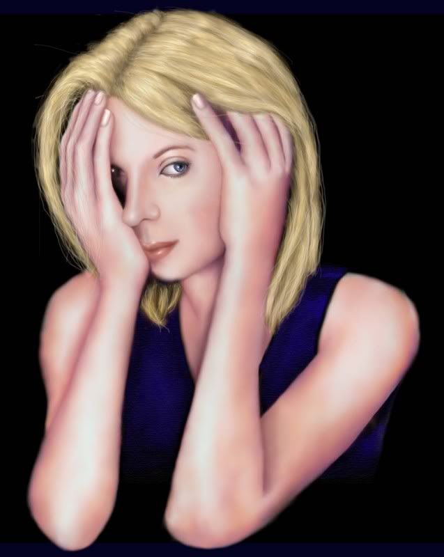
I'd add some loose strands of hair and knock back the yellow of her hair. Her skin is seen in a cool light while the hair is seen in a warm light. Try keeping your palette restrained to a specific range defined by the lighting quality.
Don't be afraid to let her elbows go past the field of the picture -- I get the feeling that you are warping the proportions of her arms just a bit in order not to cut anything off.
I love the skin texture and the soft modeling. It really sets up a contemplative mood!
Reign
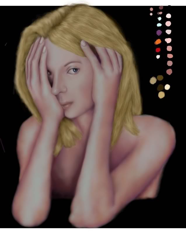
This is a project I have been working on off and on for a while. It is a gift for a friend who has been very supportive through all of the ups and downs my family has had lately. I wanted to try and finish it this week so that I could start on my fucking fairy, but I could use some fresh eyes. I have only detailed the hair on one half of her head so far. I am happy with the shape at the top, but I don't like the ends around her shoulders. It isn't looking natural to me. I would be grateful for some help.
Reign
Wystro
19 years ago
Rae
19 years ago
Thanks Wystro. I will give that a try when I am not seeing double. Yep, the messy spots off to the side would be my color palette. Softening the hair will probably help me hate it less. Earlier versions were actually more saturated than this. I will pick some cooler colors and work the ends a bit more then let you know how it goes.
The elbows were a guess on my part. The photo reference I used for the pose cut them off. I am trying to give the impression that she is leaning over a table. Extend the elbows more? My mother already said they were boney.
Thank you again for your help, and the completment. :)
The elbows were a guess on my part. The photo reference I used for the pose cut them off. I am trying to give the impression that she is leaning over a table. Extend the elbows more? My mother already said they were boney.
Thank you again for your help, and the completment. :)
Den
19 years ago
Wow Rae -- I bet she love(s)d it, if she's seen it yet. It's quite unique.
Verileah
19 years ago
Geez, I can't get over those hands - they really look good. As far as her hair goes, it seems like it's got good mass and form (though I think she needs some shadow along her bangs, the hair kinda goes flat there) but some long, loose, continuous strands would serve her well I think. I think that would be the main thing, would be making it appear more continuous, like you've just drawn straight from root to tip. Somewhere in the texture you kinda lose that atm.
Wystro
19 years ago
I had posted this privately to Rae first. I crudely replaced the color of the hair with one more akin to the skin tone and used the gold tone to color dodge some highlights
http://sparkles295.tripod.com/sitebuildercontent/studiommo/haircrit.jpg
Even here, I think I kept some of the yellow too hard, especially by the scalp.
I think that art and especially freehand art is a form of seduction -- we aren't trying to bring the artpiece to the viewer's world, we're trying to take the viewer into the world of the art. The soft, enigmatic sensuality of the skin, eyes, and pose of Rae's piece are the star and the rest takes a back seat. Just like when a beautiful woman (or man) enters the room, all else fades because their beauty possesses you. The strength of their beauty or their vibe knocks back the rest of the world just as the sun dims out the stars of the night sky.
We don't paint just what the eye sees, we paint what the mind and heart sees. As artists, we can literally bend reality the way our heart bends it when we feel beauty, love, sadness, terror. Never underestimate the power of knocking back extraneous elements to bring forth the full effect of your message.
Rae
19 years ago
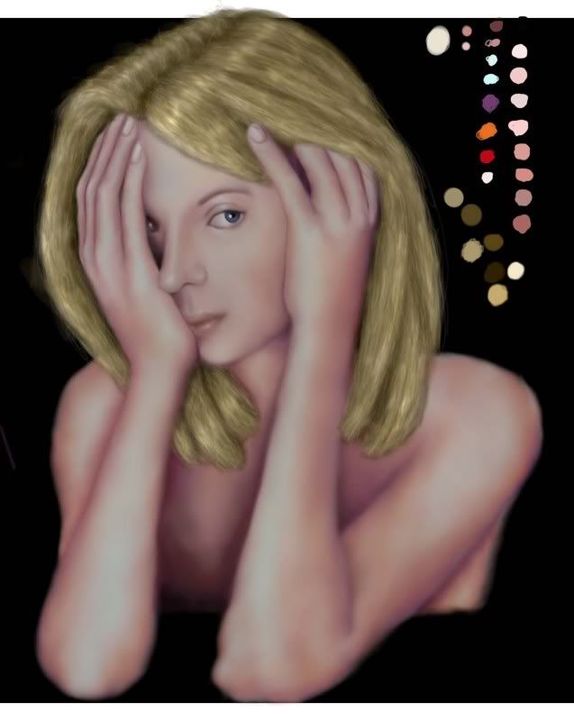
Wystro rocks my world! Thank you for all you help. Veri and Mai have been terrific (and patient) as well. This is where I am right now. I like the shape better I think. I will probably smooth the hair out a bit more. Depends on how it looks in the morning. Thanks again to everyone for the help.
Reign
Reign
Lunna
19 years ago
*nod* I've always valued the feedback and comments I get from Wystro. Good stuff.
I don't have anything to ad other than I really like this piece. The hands and expression especially.
I don't have anything to ad other than I really like this piece. The hands and expression especially.
Rae
19 years ago
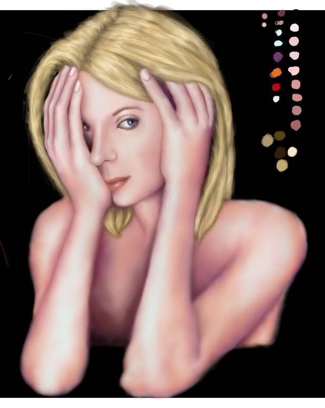
I wouldn't be if there were not at least one Raeism per piece of art work. I am going to go ahead and confess because Mai would rat on me anyway. At some point I had hit the opacity on the main layer and knocked it down a bit. Thinking I had done something with the shading, I left off working with the figure and decided to move on to the hair, thinking I would figure out the problem later. So, um, you will notice that Reign is a bit pinker and less faded than earlier versions.
I finished detailing the visible eye and adjusted the lips to be proportionate to the face. Taking Wystro's advice I added a bit more warmth to the face and I think that has made a big difference as well. Changed the hair again.
Reign
I finished detailing the visible eye and adjusted the lips to be proportionate to the face. Taking Wystro's advice I added a bit more warmth to the face and I think that has made a big difference as well. Changed the hair again.
Reign
Wystro
19 years ago
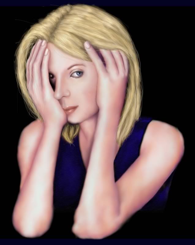
I *love* that shirt! It really does add a lot of punch to the picture and also balance to the colors! Good work with the hair too -- this is moving in a very good direction. For some reason I'm noticing the lips more and how nice they look.
Allowing the torso to fade to black and join with the background does wonders for the composition and brings out the arm placement. There is though a sharp point on the side of her left elbow that I would file down a little bit - her other elbow has a gentle roundedness that I think could be applied just a bit to the other side.
Both the product and the continuing evolution are beautiful to see!
Lessa
19 years ago
the space under her hand ( eye) seems odd to me.. though wystro didnt say anything so thinking Im wrong haha
other than that ( to me) ooks fantastic to my newbish eyes!
other than that ( to me) ooks fantastic to my newbish eyes!
Wystro
19 years ago
That eye thing could probably be smoothed over by having the shadow more consistent, not a big black space, mind you, but a whole lot less contrast.
Mai
19 years ago
She's looking good. Much better now that's she's brighter. Excellent job on the skin tone. Definitely your best so far. :)
Rae
19 years ago
Actually Lessa, you are right about the eye. I have been having trouble with it. I would work on it for a while and then get tired of it and work on something else. An eye patch was beginning to look like a good idea. I tried to work on it a bit more before giving in to the eye patch idea.
Reign
Reign
Wystro
19 years ago
The eye may not be placed exactly right, but you get the idea! It may make it more real to let it actually fade a lot in the shadow.

Wystro
19 years ago
Be careful with photographs -- they flatten and distort perspective, especially in eye placement. Everything gets pushed into one plane and gets a bit distorted. You can trust photos for values, but they always need some form of correction for perspective. That covered eye will not look like that in actual life.