Does it have to have sparklies?
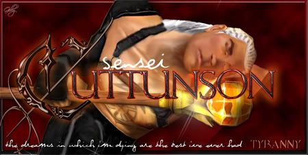
The name is a little hard to read, but I really like what you've done with it and I hesitate to suggest anything that would change it. Instead, perhaps brightning the bg would make the name more readable? Also, maybe the quote could be done in small caps and a touch heavier. Small caps just because 1. you have a lot of all caps and the contrast might be nice and 2. to give yourself a little more room to make the type heavier without actually taking up more real estate.
I think the motion blur is a little too heavy handed. I like the softer smokey look of the girl. Keep the diagonal flow imo; it provides a nice tension to have the converging diagonals between the weapon and the "dreamy stuffs". Maybe just a more organic blend into the girl, using the same glowy oranges and yellows.
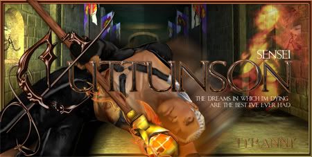
Cuttunson...c/c the hell outta this one.
I have to fix his hair but can't at home and haven't had time at work. In the meantime I could use some c/c on the rest! It needs sparkles still too hehe.
Verileah
21 years ago
ROzbeans
21 years ago
Separately the piece is good, Gilly. The font is hella cool (what is that for the big C) and the colors are beautiful and vibrant, but there are a few things that dont seem to flow for me.
His placement, in feign death position, with the background doesn't seem right. Who is the girl and why is she in the sig? I agree with Veri on the motion blur on Cutt. It doesn't add to the piece. Your text looks great but the color blends in too much and its hard to read.
What was cutt wanting with sig? Or what were you aiming for? I guess his FD position is just odd because his staff is sticking up in the corner. I know you said you'd get to the hair but the effects on the staff doesn't add to the piece either. His pants blend in too well, maybe highlight those a little more as well.
Honestly I dont use the FD as a pose because unless its a funny sig, its hard to build around it. Where is that girl from? I can't put my finger on it but I've seen her before.
That's about c/c 4.9. Again separately it looks good but together the sig overall doesn't want to flow. Still digging that big C though, what font is that!?
Gilae
21 years ago
Yeah the whole thing is bugging the crap outta me. I liked the idea of doing a feign death sig, but there is no background that you can sit him in where he actually looks like he's on the ground. He wanted to put some nekkid chicks in there and I had thought about putting him on a chicks lap but that wouldn't work either so I opted to make it look like he was dreaming about them while he was FD. I was going to put a quote in there that said something like "what monks are really doing during pulls" but I went and got all artsy fartsy with it instead. I'm seriously pondering tossing the FD pose out the window entirely hehe. Truthfully the motion blur was meant to hide the fact that he seriously looks like he's floating above the concrete. Maybe just take out the background and leave him on black?
I think we're talking serious back to the drawing board time with this :/
I think we're talking serious back to the drawing board time with this :/
Vex
21 years ago
gunna be short and sweet with it, since ver and roz already said a lot. i'm just reinforcing it.
composition is different, and can be useable, but he's just splatted as a corpse in mid air on a background that doesnt belond. the angles aren't the same, so perspective is off.
the text is unreadable to me, there is no focal point on the sig, my eyes are darting everywhere trying to find its purpose. while it appears you put a decent amount of effort into it, if i was the receiver of this sig, i would not be content with it. It just doesnt appeal to me.
Gilae
21 years ago
I tried it without the background...I'm still not happy with it. I thought of one more thing I can adjust to fix it and if that doesn't work I'm tossing it and going back to the drawing board. I think my biggest issue with it is his head is under the name and is therefore fucking up the focal point.
Anyway, time to catch the train home so tah tah.
ROzbeans
21 years ago
The girl in the background seems stretched now. Honestly, go with a new pose but keep the background and the colors. Just brighten the text. I'd let the girl though go =/
Guest
21 years ago
:yeahthat
blazyn
21 years ago
keep that text..awesome song awesome lyrics just awesome
Just Erin
21 years ago
Tell me how you do your flame effects around the weapons. You used a similar technique in Blazyn's sig.
Gilae
21 years ago
So I'm working on one from scratch.
Here's the original Screenshot:

And here's what I've got going so far:

In answer to some questions I didn't answer cause I was all in a hurry to get stuff posted, the font for the C is called crumble. I do the effects by using the "liquify" option in the filter commands. I then either recolour it or use a variety of layer effects to make it funky. Then I put another layer of something similar on the top. I think I sometimes get out of hand with it hehe.
Anyway, I'm already feeling better about this new sig. Hopefully it'll come out ok.
Here's the original Screenshot:
And here's what I've got going so far:
In answer to some questions I didn't answer cause I was all in a hurry to get stuff posted, the font for the C is called crumble. I do the effects by using the "liquify" option in the filter commands. I then either recolour it or use a variety of layer effects to make it funky. Then I put another layer of something similar on the top. I think I sometimes get out of hand with it hehe.
Anyway, I'm already feeling better about this new sig. Hopefully it'll come out ok.
Gilae
21 years ago
Alrighty...are we getting somewhere or what do you guys think?

ROzbeans
21 years ago
ROzBeans: oh sexy eyes!
ROzBeans: how'd you do the armor?
ROzBeans: the thingy thing looks too dodged
rmceachn: i cut it out and brightened just that part
rmceachn: i didnt even know monks had that stuff on em
rmceachn: you think it's too much?
rmceachn: i thought about taking the saturation out of it and going silver
rmceachn: but his stick is gold...
ROzBeans: you could use the magic wand or just dup the layer and cut out his flesh and head, then adjust the levels, then dodge the rest.
ROzBeans: his hair looks much better, but the back part doesn't seem part of the hair. the trick kat taught me was lasso'ing the hair then smudge on low intensity, then dodge/burn in the highlights.
ROzBeans: how i do the...dang it i'm posting this lol
K, what I was saying was, how i do the ends of my hair is setting the brush to fade in the brush options. Bigger the number, longer the length. Also if you start with a large enough brush, start with the shadowed color (darker color) and then I brush in the highlights. I run burn with a huge brush at the end. That's how I did the House of Andar DE hair. Granted wispy hair is all I can do.
Over all it looks much better. I like the staff on his back. Work on the armor to bring out the details and textures of the straps and such. Makes more sense otherwise what is the staff holding onto? EEP!
Touch up the skin by his jawline, looks like shadows left over from the screenshot there. I used an airbrush set on like 20-30 opasity. Easier to touch up the skin that way. I like this one MUCH better miss ruthie =) Good job :thumbsup
Gilae
21 years ago
Ok...I tried something new...but I dunno...seems a bit wild to me! Seriously, help! Is this an improvement or no? Just looking at it I can see places that need serious fixing.

versus this one:
versus this one:
ROzbeans
21 years ago
I literally sat back and said 'WHOA' now that is some crazy hair LOL. I like it, it looks good but I think the guys in AOT will hassle cutt big time for having big hair. I think that might be better suited on a female and angle it down more. That's some serious Christie Brinkley in a wind tunnel hair LOL I LOVE IT! It has texture and it has depth, just lay it down on his shoulders.
A few wisps coming off the front of his forehead, just a couple strands would work. Do your body layer and then on top do your wisps. Remember if you're hair is blowing in one direction, you can't have a wisp lying in his face pointing in the other. Definitely more defined, less smudgy. Big step :thumbup
A few wisps coming off the front of his forehead, just a couple strands would work. Do your body layer and then on top do your wisps. Remember if you're hair is blowing in one direction, you can't have a wisp lying in his face pointing in the other. Definitely more defined, less smudgy. Big step :thumbup
Vex
21 years ago
eek..
reminds me of hair band days... Definitely needs to tone that down ><
reminds me of hair band days... Definitely needs to tone that down ><
Gilae
21 years ago
Mike (my husband) says the one I did the first time looks like a airbrushed picture of Elvis on black velvet.
I was laughing right out loud at the Christie Brinkley in a windtunnel and Mike came in to ask what I was laughing at. He think's there's too much sideburns involved in all of it. I was working on it today in between trying to actually do my REAL job and yeah the distractions made it even more difficult then the trying to figure out what the heck I was doing. I just kept adding more freaking layers lol.
If at first you don't succeed!!
Guest
21 years ago
omg gilae i love ya. Ive been about to cry all day cause im in pain and that hair took me by such suprise ( I think i was expecting sexy instead of crazy) that i just started giggling and couldnt stop. Tears rolled down my face.
I really hope that doesnt offend you, omg youve got great talent, but it threw me off. I owe you big time for making me feel better tho :)
I think you have a lot of creativity in you, the fact that you are trying so hard to go with something different rather than some artists where you see the same thing all over, it just says a lot about your art.
<3
Gilae
21 years ago
Not offended at all...you shoulda heard my husband laughing at it!! I was like "hey! we're supposed to be laughing at what Mae said!!" but he was laughing before I had even scrolled down that far ;) We're going to try again until we get it right!!
Gilae
21 years ago
Ok...so how do I get his hair to look "shiny"? It's layered but it still looks dull to me. And to make it look like I'm actually getting somewhere, I gave him a background lol.

blazyn
21 years ago
i think its awesome