Might As Well..
Might as well get started.
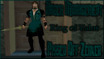
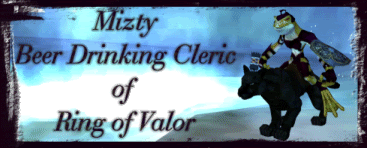
Here is a few of the last signatures I have made. Looking for ways to expand my work. Don't mind criticism however I already know most are "plain and flat", kinda how I liked it and people have liked from me until one guy asked for some flare (hence the smoke text).
Usually I just do Screen shots and add fancy text or when someone finds a non copyrighted graphic they want I try to make a sig that looks good out of it.
He wanted the face of an owl.

He wanted some Flair, so made this one and one with smoke.


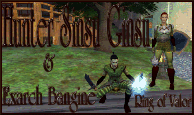
This one was a little work trying to get the weap to look good from a screenshot, manipulated to get the person out and the weapon to sit right.

Played around with text and wrap

Played around with textures
Played around with cut out for these two:

didnt like how white kept showing up on this one though:

Kelefanes Tried to play with lighting:


Another cut out, blended to match the color of that person's forums so may not look right here:

I have TONS more, but wont keep you bored.
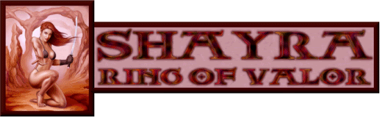
I like your style, especially the size you work in. One thing, anyone try and bust your chops yet about using art from other artists? I noticed your Shayra sig - I'd be careful where you showcase that, some people can be VERY pissy about it.
Here - if you don't mind saying where you got the piece, we won't trip over it. Just be careful, or else they'll send the crazy cats out to git ya! =D
Talking of borrowed pics, a guildie of mine has a sig which was originally one of yours Roz, the one of Ellis against the moon, but they coloured her blue o.O I know it wasn't them who made their own sig, but I don't know who made it for her either.
For Shayra's I got it from her. After much searching and not finding it on the internet I went against better judgment to use it. On any "artwork" I use I try to make sure it is not a copyright issue and if it is something I have found and have a way to contact the artist I always email first. Never worth it ending up somewhere and then having a lawsuit (I know its just the internet right?! still dont want to have that happen).
Far as text contrast I do my best to try and work Bold or Bright against dark backgrounds or if its a light background a darker text, I have found a glare or glow behind it has helped me, and I have found that most people have liked it. However I do get bored with it sometimes.
Thanks for the feed back, I will post some more =)
Was going with a tropical theme for both of these and couldnt decide if I even liked either. She wanted flower to show in first one, but I didnt like how the text looked under it.


One of my Fav Screenies I have done.
Again tried to play with texture with in the font, but had to lighten edges for it to contrast.

no freaking clue how i got this border or how it looks so shredded, been trying to recreate with no luck:
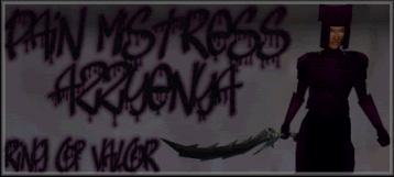
He wanted it to look like blood was pouring
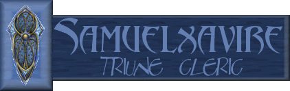
Simple epic signature, spic picture was provide from cleric.
Played with lighting to make it look like hand was glowing was glowing

Made with default tube in PSP, didnt like the wrapping of text between the music sheet, but this guy LOVED it.. It was one of my first attempts with wrapping text.

Playing with textures again, although I think text it is hard to see the opposite texture of the background

YES I still have tons more

This is one I did for myself, made to match a message board (hence the white background). The graphic was a tube I paid for from some site, this is probably 4 years old, but minus the white background I loved it.
I''m liking these so far, my attempts ate screenshot art were erm....well, I never showcased them rofl.
No prob for the derail, and I would love to see.
I dont often see others screen shot works. I always did them cause it was what was easy, then I found ways to spice it up (and still looking for more if anyone has ideas).
As for ideas, I'd just like to throw out a thought - don't go against your better judgment. I mean, yeah, listen to your clients, but do what you know looks good.
There has to be a tutorial out there for the shredded border. Other ideas might be a burned/charred border (might look esp. neat with transparencies), some of that Victorian looking scrollwork (might combine that with clockwork pieces for a steampunk look), Celtic knots..but the clean simple borders are great too, esp. if you have a lot going on with your illustration. Borders don't have to go all the way round, either - you can imply lines with strong corner pieces.
Ideas for text - doesn't always have to be big and centered (*hides from Roz*). Esp. if you have a 'full' illustration, might be nice to try it in its own space at the bottom, integrated as part of the border, etc.
None of that is crit btw - just more ideas for stuff to play with.
http://www.photoshoproadmap.com/Photoshop-blog/2007/07/22/the-best-80-photoshop-text-effects-on-the-web/
There's a nice tut for text effects.
They pwn - Listen to them!
And we have successfully hijacked this thread again. =x